
The Evolution of Aesop: From Simple Hand Soap to Design Icon
Oct 17, 2024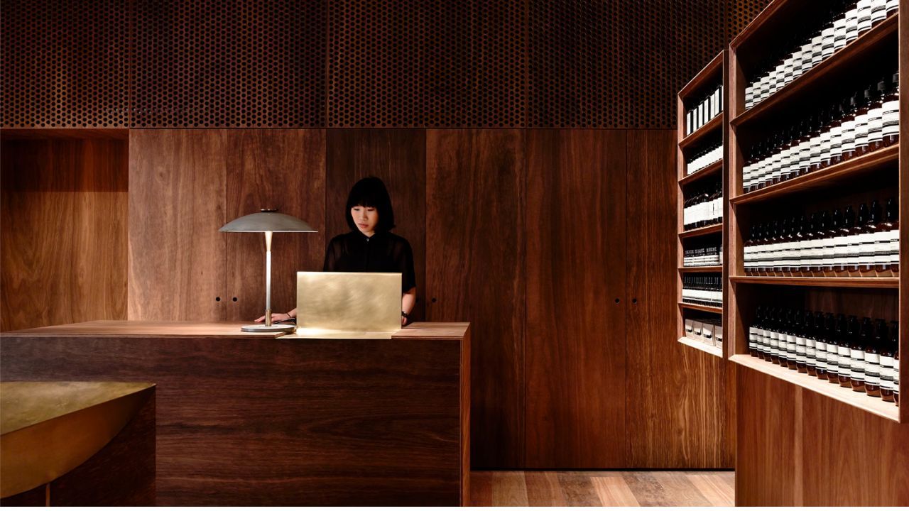
When you think of iconic bathroom aesthetics, chances are the sleek, minimalist bottles of Aesop hand soap come to mind. Once a humble product, Aesop's hand wash has transcended its utilitarian function, evolving into a status symbol, a design feature, and a brand synonymous with understated luxury. But how did a simple hand soap, something we often overlook in our daily routines, come to carry such weight in the world of product design and branding?
The Rise of Aesop: Thoughtful Design Meets Practicality
Aesop was founded in Melbourne, Australia, in 1987 by hairdresser Dennis Paphitis, initially as a haircare brand. But the company quickly gained recognition for its skincare products, especially after it expanded into personal care items, like hand soap. What made Aesop different from other brands was its focus on high-quality ingredients, minimalist packaging, and a carefully cultivated aesthetic. This was no ordinary hand soap. From the beginning, Aesop aimed to blend natural, plant-based ingredients with scientific advancements, appealing to a discerning audience that cared about both efficacy and elegance.
At the core of Aesop’s design philosophy was the idea that every touchpoint with the consumer should be intentional, including the packaging. The brown, apothecary-style bottles weren’t just for show. They were designed to protect the natural ingredients from sunlight, maintaining the integrity of the product. But that same bottle became a design icon in itself—its simplicity was a bold statement in a world of over-the-top packaging. It wasn’t long before Aesop hand wash became a coveted bathroom accessory, adorning the sinks of upscale homes, restaurants, and luxury hotels.
Aesop and the Art of Subtle Branding
Aesop’s rise to prominence in the design world wasn’t accidental. The brand’s commitment to subtlety, authenticity, and quality positioned it perfectly for the modern consumer. Aesop never splashed its logo across billboards or pursued celebrity endorsements. Instead, it relied on word-of-mouth, high-end retail placements, and brand integrity. Aesop products quietly entered homes, offices, and public spaces and quickly became recognisable for their iconic design and the luxury they signalled.
Over time, this intentional quietness became a strength. The absence of loud marketing created a mystique around the brand. Aesop’s unbranded, monochromatic bottles didn’t shout for attention but rather invited a discerning eye. The brand’s design elements—glass bottles, typewriter font labels, and monochromatic tones—were both timeless and modern, allowing it to blend into any environment while still making a statement.
In an era where minimalism became the aesthetic du jour, Aesop’s products fit perfectly into carefully curated interiors, becoming an Instagram favourite and a fixture in magazine photo spreads. The brand's ability to seamlessly integrate into high-design environments, from hotels to TV shows, cemented its place as a must-have design feature. Aesop bottles, once utilitarian, were now sought after for their design prowess as much as their function.
The Power of the Aesthetic
What Aesop did so well was align their product's appearance with the evolving tastes of its target market. At a time when consumers were shifting toward a preference for understated luxury and sustainable beauty, Aesop was there, offering an aesthetic that felt not only modern but enduring.
You’d often see Aesop hand soap in beautifully designed spaces—boutiques, high-end restaurants, even on the sets of popular TV shows. That placement wasn’t just because the soap smelled good or worked well—it was also because Aesop's branding, packaging, and ethos had come to symbolize something more. Aesop became shorthand for taste, style, and an appreciation for craftsmanship. That’s why Aesop hand soap could turn up in a character's home on television or in a luxury restaurant’s bathroom, seamlessly fitting the narrative of sophistication and care.
Ingredients Matter Too
Of course, the product itself had to live up to the design. Aesop’s hand soap, and its other skincare products, are celebrated for their natural ingredients, which are ethically sourced and feature botanical extracts and essential oils. From vetiver root to bergamot rind and rosemary leaf, Aesop’s formulas were designed with skin health in mind, giving customers a luxurious experience that felt good and smelled incredible. The blend of nature and science in their formulations further fuelled the brand’s appeal to consumers who were looking for performance without compromising on environmental and ethical standards.
A Lesson in Branding and Product Design
What can product designers and brand builders learn from Aesop? The key is that Aesop didn’t just design a product—they designed an experience. Every element, from the ingredients to the packaging to the retail environment, was meticulously considered and aligned with their brand values. This level of thoughtful consistency allowed Aesop to go from niche product to global design icon.
Aesop’s success teaches us that product design and branding are about more than just looks—they’re about creating something that resonates with consumers on a deeper level. When done right, even a simple hand soap can become a cultural statement.
So, next time you spot that familiar amber bottle in a bathroom or on your favourite TV show, remember it’s not just a hand wash—it’s a symbol of how thoughtful design and branding can elevate even the most everyday items into something extraordinary.
